Singletree Farm
The Ask:
A brand refresh for Singletree Flower Farm that brings in more color and reflects the owners personal design style to attract non-traditional bridal clients who want more whimsy in their wedding florals.
The Solution:
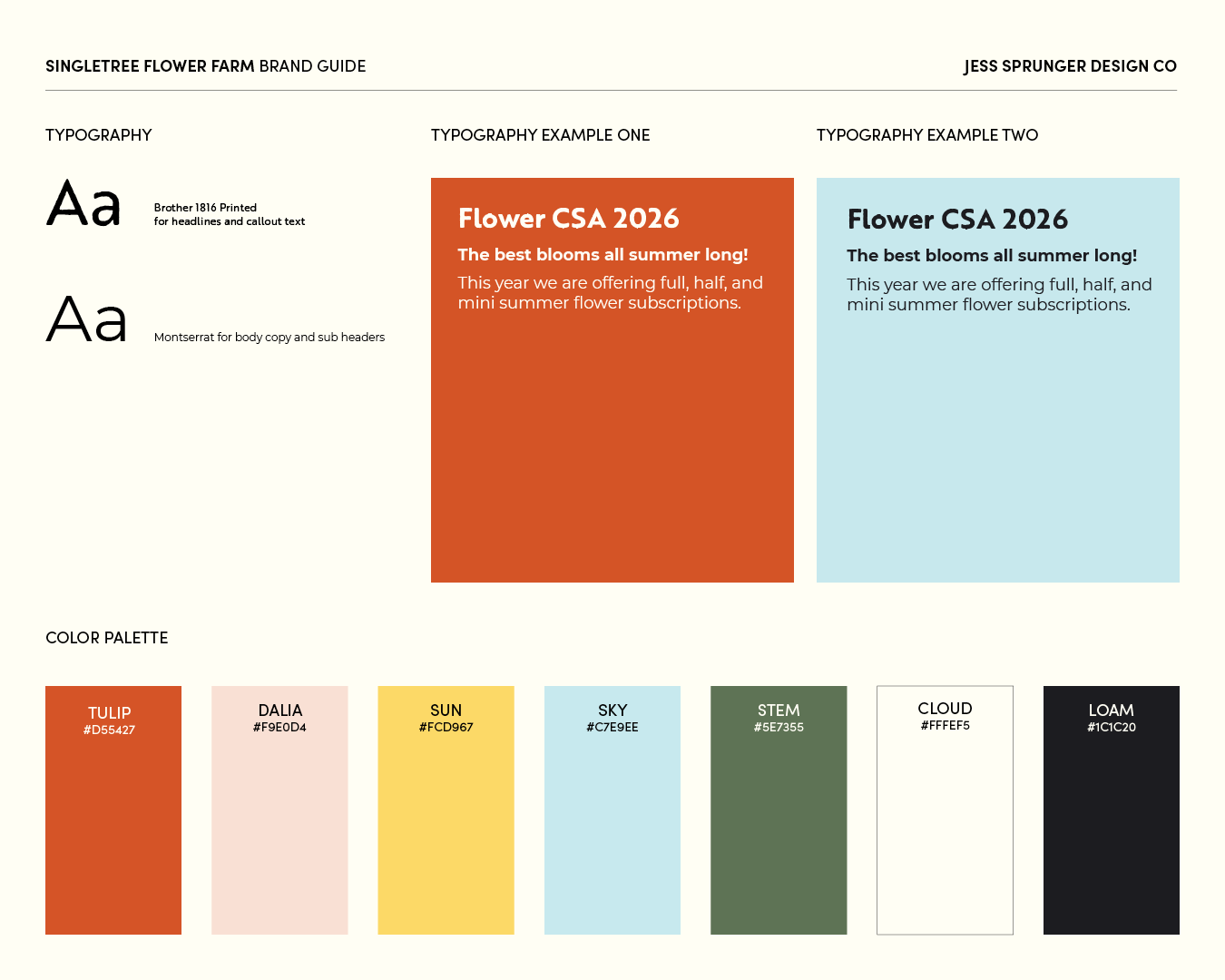
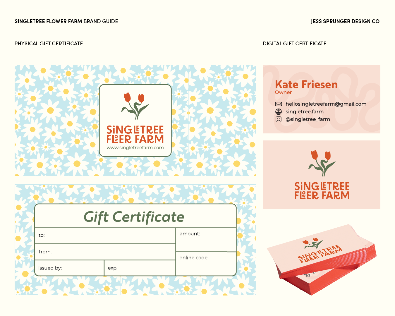
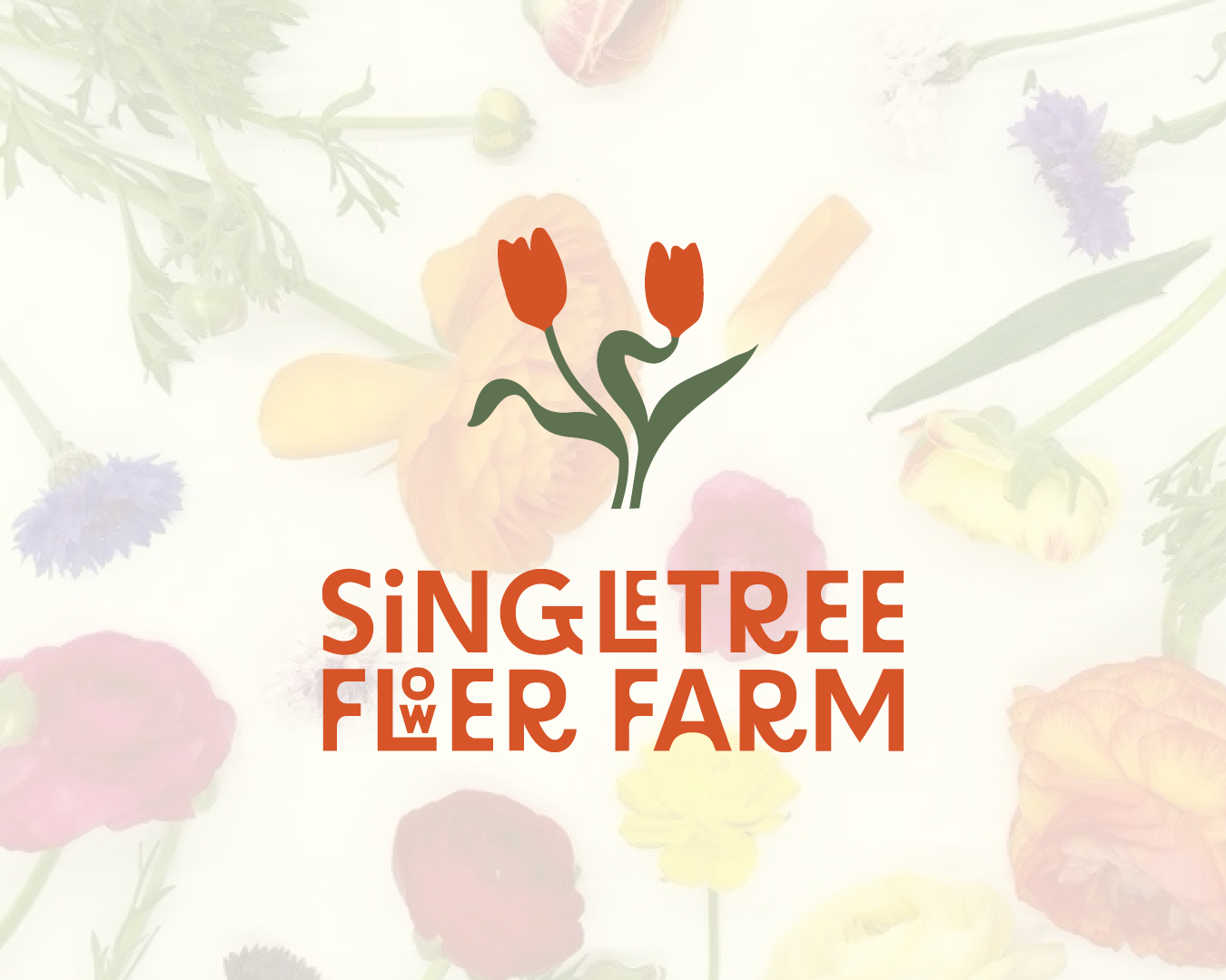
The flower farm needed a cohesive brand identity after years of one off designs. I paired bold colors drawn from nature with sturdy earthy fonts and floral patterns. Organic flowing lines mimic nature and flowers following the sunlight in a little dance.
Contributions:
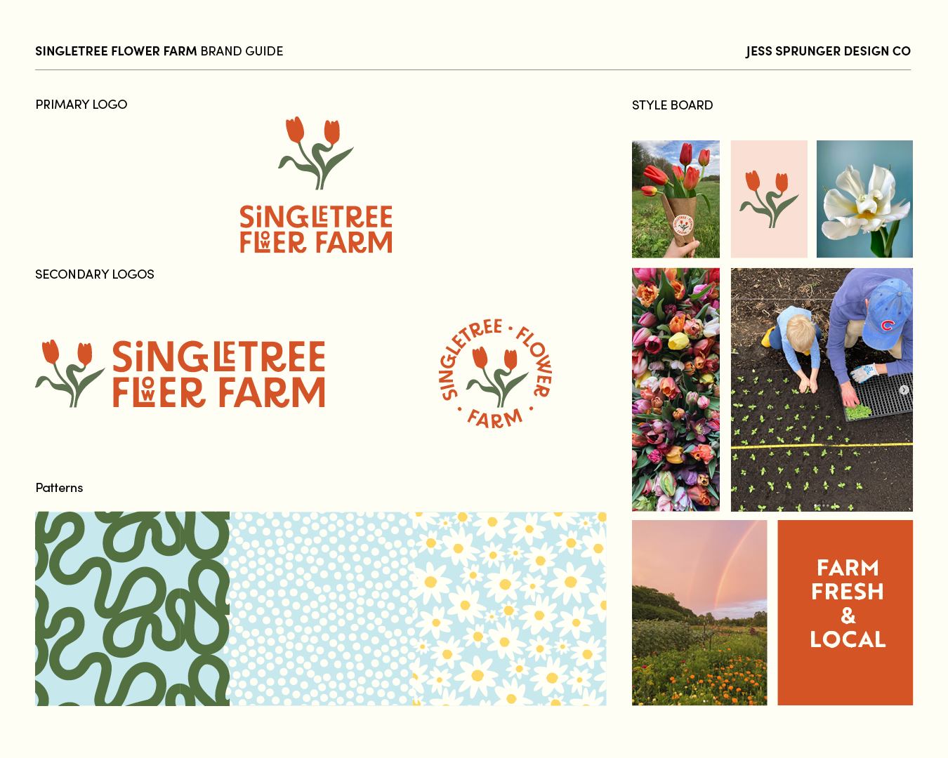
Logo Design
Brand System
Project Type
Rebranding
Print + Digital Design
Concept
The farm needed a cohesive identity that reflected the joyful, whimsical style of their flower arrangements. I was inspired by the way flowers follow the sun in a little dance and rooted all of my design decision in the keywords funky, grounded, and movement. You can see this at play in the type choice for the logo - the R looks like its kicking up its foot in glee, and the winding vine lines that dance across the business cards.